
Jujutsu Kaisen Season 1 vs Season 2: Which has a better art style?
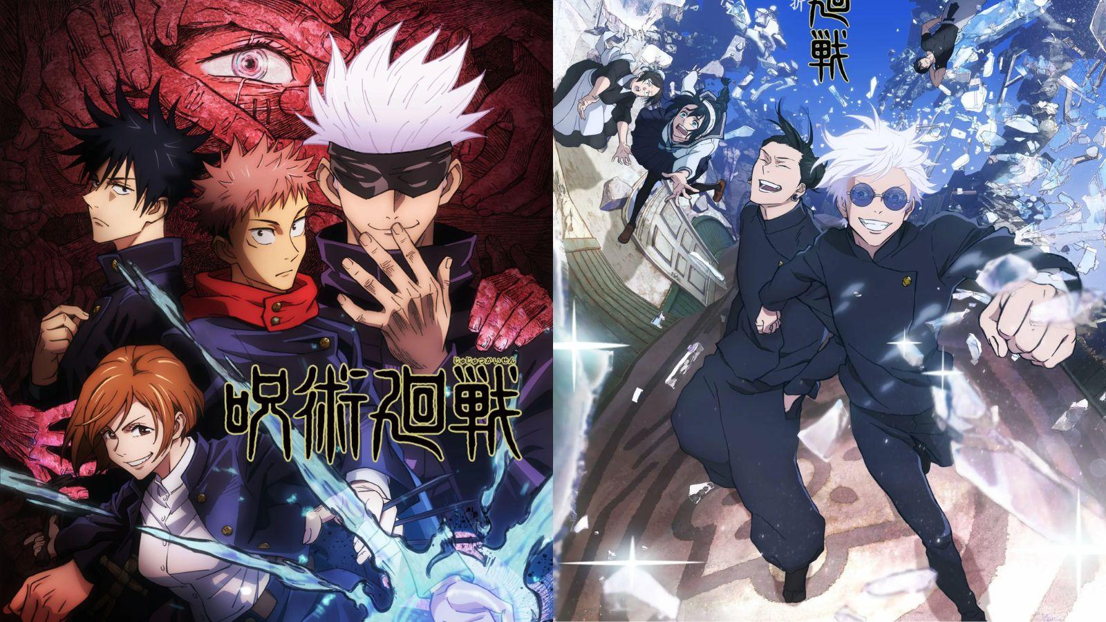
The most intriguing part of Jujutsu Kaisen Season 2 is the unique art style, which is completely different from its previous season. However, which season has better animation?
MAPPA has completely changed the art style for Jujutsu Kaisen Season 2 by making it simpler and more fluid. The blue tone gives a summer vibe, which is perfect for a high school theme of the Gojo’s Past arc.
However, art is subjective, and varying opinion divides the fandom in two. The animation in Season 1 was amazing with the level of detail and intricate character design. Although most fans appreciate the simple animation’s beauty, some miss the level of detail they’re used to.
However, while Season 2 doesn’t have the intricate touch like its previous season, it can still better adapt to the manga. There are pros and cons in both styles. Here’s what we think is the better anime adaptation of Jujutsu Kaisen.
The clutter and poor color palette in the Season 1 art style
There’s no denying that Season 1 quickly draws viewers in with the insane animation. However, the more detailed the art, the more mistakes are bound to happen. There are times when the intricate style ends up making some scenes confusing. Too much detail often deviates attention from the main element and makes the scene look more chaotic.
 Crunchyroll
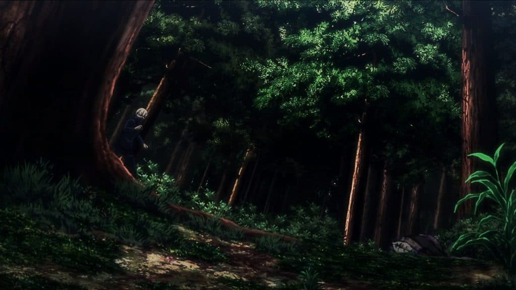
For example, the image above features the moment Toge Inumaki first encounters the special-grade spirit Hanami. However, the shot has so many elements in it that it’s difficult to spot Toge and the body of the semi-grade one spirit. This is why we can appreciate the simplicity of the new season. Fewer details make it easier to focus on the characters.
 Crunchyroll
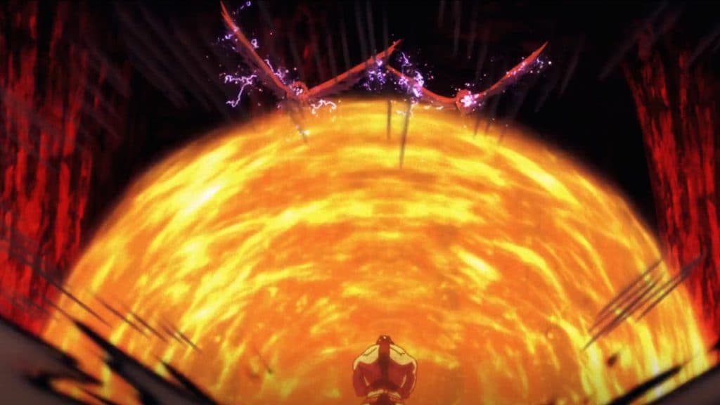
Another example is Megumi’s fight with the cursed womb, where he uses his Domain Expansion. This is Megumi’s best moment in the entirety of the series. Sadly, the poor color palette and lighting make it difficult to see what’s happening.
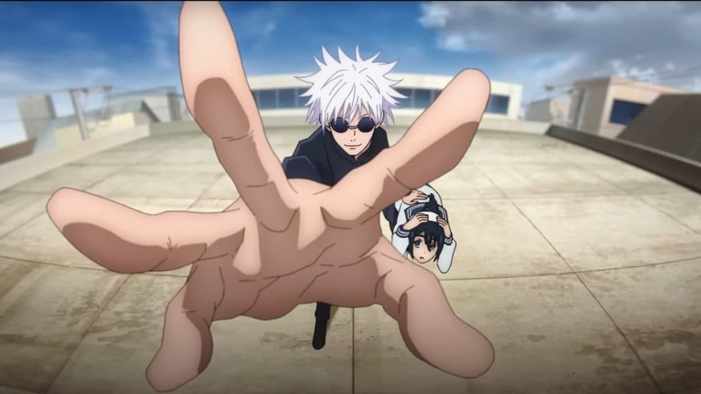
The lack of detail in Season 2 allows fluid fight scenes
 Crunchyroll
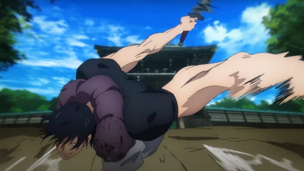
While it’s clear that MAPPA has downgraded the detail by a lot in the new season, it actually works in their favor since they can create more fluid fast-paced scenes. The primary reason for this change is Shōta Goshozono replacing Sunghoo Park as the director in the second season.
Toji’s scene where he approaches to attack Gojo is a perfect example of this. There’s a brief moment when Toji comes close to the screen. He then rushes back to come forward again and swings his blade at the screen.
This is very different from the manga and gives an idea of the director’s unique perspective. All this happens for about two seconds, but the lack of detail helps keep all of our attention to only Toji. Viewers also get a better understanding of Toji’s superhuman speed.
Jujutsu Kaisen Season 2 art style may fall short in some aspects
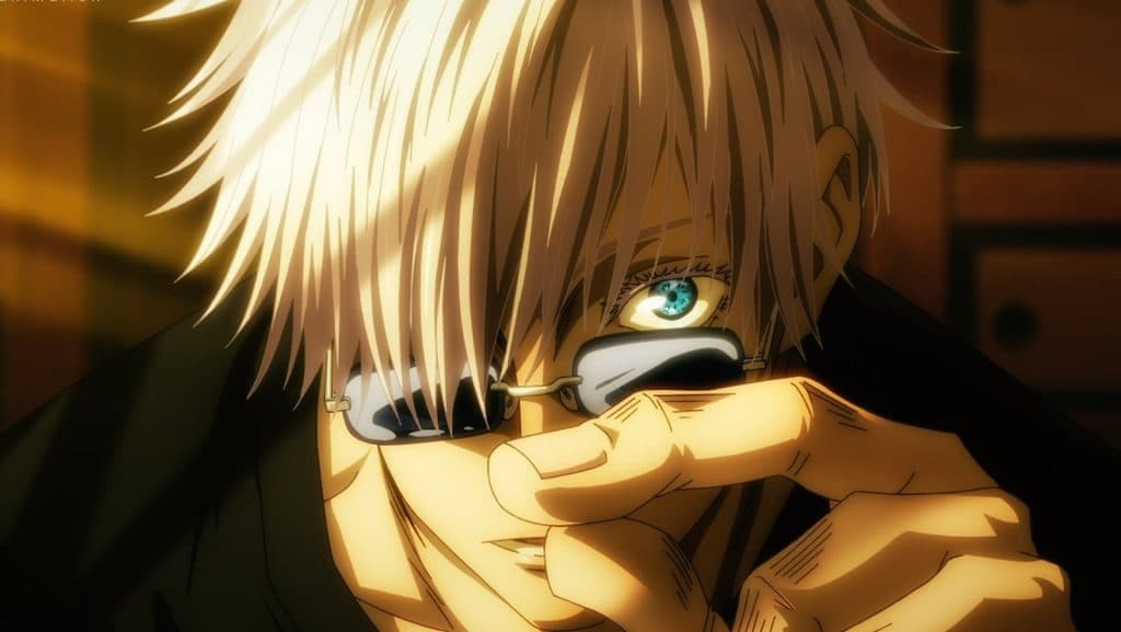 Crunchyroll
As mentioned earlier, both styles have pros and cons. There are just some things that Season 1 portrays better with its beautiful art style. For example, Gojo’s godly eyes highlight his character like nothing else. The downgrade in his eyes gives him a youthful look, and it’s actually good when you get used to it.
However, the difference is pretty clear when comparing them to the first season. That said, with the simple art style of Jujutsu Kaisen Season 2, Gojo’s detailed eyes will stick out like a sore thumb. Another element that’s better in Season 1 is the design of complex characters such as Hanami and Sukuna.
Subscribe to our newsletter for the latest updates on Esports, Gaming and more.
With all their markings, these characters require more detail to properly portray their individuality. While Season 2 may not be bad in this aspect, assuming it can surpass the previous character design is difficult.
Final thoughts – Jujutsu Kaisen Season 2 has a better art style
 Crunchyroll
There’s no denying that Season 1 is better in terms of visual effects. That said, while Season 1 appears to be a very beautifully animated series, Season 2’s new animation style offers JJK a unique identity by adding a straightforward yet stylistic flair.
It provides its characters and setting far more expression and emotion than Season 1 ever could. Jujutsu Kaisen Season 2 will feature more fights than scenes. Approximately 75 percent of the story is pure fight. While Gojo’s Past Arc will pick up the pace from the second or third episode, Shibuya will literally be a war zone. Even after that, all the story ever features is simply never-ending battles.
Therefore, it’s actually a good decision on the studio’s part to opt for simplicity, allowing them to make fewer mistakes. The first episode of Gojo’s Past Arc proves that the animation maintains consistency in every scene, which was lacking in the first season.
Furthermore, the Shibuya Incident will take place at night. In the key visual, the lighting, characters, colors, and even the background look incredible despite being less detailed. It will allow viewers to focus better on the main characters if the background is less detailed.
Jujutsu Kaisen can currently be streamed on Crunchyroll and Netflix. In the meantime, check out our other anime coverage below:
Demon Slayer Season 4 problem | Jujutsu Kaisen Season 2 Episode 2 | Jujutsu Kaisen Season 2 main villains | One Piece’s voice actors | One Piece live-action Straw Hat Pirates | Jujutsu Kaisen Gojo’s Past Arc | Jujutsu Kaisen schedule | One Piece Sun God Nika | One Piece Vegapunk | Demon Slayer Kimetsu no Yaiba meaning | Black Butler 2024